
Most people now browse the web on their phones, so a mobile-friendly website is no longer optional. In fact, it affects whether visitors stay, trust you, and contact you. Also, Google primarily uses the mobile version of your website for indexing. A usable, accessible mobile experience and strong page performance can support SEO, but mobile friendliness alone doesn’t guarantee higher rankings.
In this guide, you will first learn what a mobile-friendly website is and why it matters. Next, you will learn how to make a website mobile-friendly step by step, with real examples. Finally, you will get a checklist and answers to common questions.
What Is a Mobile-Friendly Website?
A mobile-friendly website adjusts its layout, text, images, and buttons to fit any screen size. As a result, visitors can read and tap everything without zooming or scrolling sideways.
Responsive web design is the most common approach to making a website mobile-friendly. Because it uses flexible layouts that adapt to the screen, most modern mobile-friendly website design is built on responsive principles.
Why a Mobile-Friendly Website Matters
1. Google Uses Mobile-First Indexing
Google mainly crawls and indexes the mobile version of your content. So if your mobile pages are slow, incomplete, or hard to use, your SEO can suffer. For details, read Google’s mobile-first indexing guide.
2. Better User Experience
Visitors leave quickly when a page is hard to use. For example, tiny text, crowded buttons, and slow loading send people straight back to search results. Meanwhile, a clean mobile layout keeps them reading.
3. More Leads and Sales
When your phone number, booking button, or WhatsApp link is one tap away, people act faster. As a result, you get more calls, enquiries, and orders from the same traffic.
4. Stronger Trust
A polished mobile site shows that your business is professional. However, a broken layout does the opposite, because it makes visitors doubt your credibility.
Key Features of a Mobile-Friendly Website
Before you start building, it helps to know what good looks like. Overall, this table summarizes the main features and practical targets.
| Feature | Recommended Target | Why It Helps |
|---|---|---|
| Responsive layout | Flexible widths, no horizontal scrolling | Fits every screen |
| Tap targets | 44–48px with spacing (recommended) | Fewer misclicks |
| Font size | 16px body text, clear line spacing | Easy reading |
| Navigation | Simple menu, main call-to-action near the top | Faster decisions |
| Images | Compressed, WebP, lazy loaded | Faster loading |
| Pop-ups | Minimal, easy to close | Less frustration |
How to Make a Website Mobile Friendly (Step by Step)
Step 1: Start With a Mobile-First Design
First, design the phone layout before the desktop version. This forces you to focus on what matters most. Specifically, think about your message, your offer, and your call-to-action.
Step 2: Use a Responsive WordPress Theme
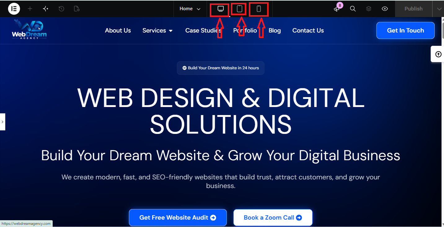
Next, choose a lightweight, well-coded theme. If you use a page builder such as Elementor, keep widgets simple, because heavy layouts can slow your pages. Then preview every page in phone, tablet, and desktop modes.
Step 3: Make Text Easy to Read
Use 16px body text, short paragraphs, and strong contrast between text and background. Also, break content into headings and bullet points, so visitors can scan the page quickly.
Step 4: Design Touch-Friendly Buttons
Fingers are less precise than a mouse, so give buttons and links enough size and space. We recommend 44–48px tap targets as a practical usability goal. However, this is not a universal requirement. WCAG 2.2 Level AA sets a 24 × 24 CSS pixel minimum, with some exceptions, while the enhanced guideline asks for 44 × 44 CSS pixels.

Step 5: Simplify Navigation
Use a compact menu with a few main options. Also, place one clear call-to-action such as “Call Now” or “Book Appointment” near the top, so visitors always know their next step.
Example mobile layout: First, put the logo on the left and a hamburger menu on the right. Then add a sticky “Call Now” button at the bottom of the screen, where thumbs reach easily. Finally, keep the menu to five items or fewer.

Step 6: Improve Mobile Website Optimization and Speed
Large images are a common cause of slow mobile pages. To fix this, compress images, use WebP, and enable lazy loading. Also, use caching and remove unused plugins. Then measure your results against Google’s Core Web Vitals targets:
| Metric | What It Measures | Good Target |
|---|---|---|
| LCP (Largest Contentful Paint) | Loading speed of the main content | 2.5 seconds or less |
| INP (Interaction to Next Paint) | Responsiveness to taps and clicks | 200 milliseconds or less |
| CLS (Cumulative Layout Shift) | Visual stability while loading | 0.1 or less |
Ideally, these targets should be met for at least 75% of real-user visits. For more details, visit web.dev.
Real example: For our client Shot By DvD, we improved the site’s performance score from 44 to 83 through speed and technical SEO work. As a result, the site became faster and easier for search engines to crawl. Read the full case study.
Step 7: Test Website Mobile Compatibility
Do not rely on desktop previews alone. Instead, open your site on a real iPhone and an Android phone, then check forms, menus, and buttons. After that, run your URL through Google PageSpeed Insights, since it shows Core Web Vitals data and speed issues.

Mobile-Friendly Website SEO Tips
Design is only half of the job. Besides that, you need solid technical SEO to support your pages.
- Keep content equal: Show the same main content on mobile and desktop, because Google indexes the mobile version first.
- Use a viewport tag: Also, add
width=device-width, initial-scale=1so pages scale correctly. - Do not block resources: Instead, let Google access your CSS, JavaScript, and images.
- Write short, clear headings: This way, they help both readers and search engines.
- Add structured data: For example, use schema for business details, reviews, and FAQs.
- Improve local SEO: Finally, add your address, phone number, and map for “near me” searches.
Example: A Mobile-Friendly Contact Section
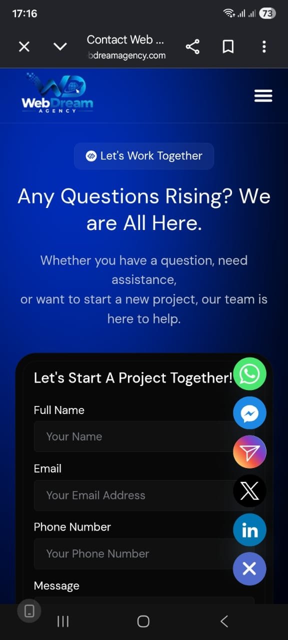
A good contact section makes action easy. For example, include a tap-to-call button, a WhatsApp link, and a short form with only three fields: name, phone, and message. Then add your address with a map link and your opening hours. Because everything sits within thumb reach, visitors can contact you in seconds.
Common Mobile-Friendly Website Mistakes
Even good websites make simple errors. Fortunately, most are easy to fix.
| Mistake | Quick Fix |
|---|---|
| Text too small | Use 16px body text |
| Buttons too close together | Add spacing and larger tap areas |
| Heavy, uncompressed images | Compress and convert to WebP |
| Intrusive pop-ups | Remove or delay them |
| Slow hosting | Upgrade hosting and enable caching |
| Hidden content on mobile | Keep key content visible |
Mobile-Friendly Website Checklist
Before you publish any page, go through this checklist.
- Make sure the layout fits every screen, so nothing scrolls sideways.
- Use 16px body text, because it is easy to read.
- Give buttons 44–48px and enough spacing, so taps land correctly.
- Keep the menu simple, while the call-to-action stays visible.
- Compress images and use lazy loading, since they affect speed the most.
- Check that LCP, INP, and CLS meet the Core Web Vitals targets.
- Keep forms short, so they are easy to fill.
- Test click-to-call and WhatsApp buttons, then confirm they work.
- Finally, test the site on real iPhone and Android devices.
Need a Mobile-Friendly Website for Your Business?
At Web Dream Agency, we build fast, SEO-friendly WordPress websites. Whether you need a business website or a medical and clinic website, our packages start at $99, and the Basic package includes fully responsive design. Also, you can explore our case studies to see real results.
Ready to get started? Request a free website audit, and we will review how your site performs on mobile.
Frequently Asked Questions
What is a mobile-friendly website?
It is a website that adjusts to any screen size. As a result, text, images, and buttons are easy to read and use on a phone.
Is a mobile-friendly website the same as a responsive website?
They are closely related. In fact, responsive design is the most common way to make a website mobile-friendly.
Does a mobile-friendly website help SEO?
It can help, since Google uses mobile-first indexing. However, mobile friendliness alone does not guarantee higher rankings.
How do I check if my website is mobile friendly?
First, open it on a real phone. Then test it with Google PageSpeed Insights, and check that text is readable, buttons are easy to tap, and nothing scrolls sideways.
What font size is best for mobile?
Use at least 16px for body text. That way, content stays comfortable to read without zooming.
What are the Core Web Vitals targets?
Aim for LCP of 2.5 seconds or less, INP of 200 milliseconds or less, and CLS of 0.1 or less. Also, these should be measured at the 75th percentile of real visits.
How much does a mobile-friendly website cost?
It depends on the size and features. Our packages start at $99, but the final price depends on your project scope.
How long does it take to make a website mobile-friendly?
A new website typically takes about 5–14 days, depending on project scope. However, for an existing site, the timeline depends on its current issues.
Final Thoughts
In short, a mobile-friendly website helps visitors use your site easily, and it supports your SEO efforts. So start with the checklist above, fix the biggest issues first, and test regularly.